Real-Time Graphing in Python
In data visualization, real-time plotting can be a powerful tool to analyze data as it streams into the acquisition system. Whether temperature data, audio data, stock market data, or even social media data - it is often advantageous to monitor data in real-time to ensure that instrumentation and algorithms are functioning properly.
In this tutorial, I will outline a basic function written in Python that permits real-time plotting of data. The function is simple and straight-forward, but its powerful result allows any researcher or data analyst to take full advantage of data monitoring as it streams into the user's computer!
Python Real-Time Plotting Function
The GitHub repository containing the code used in this tutorial can be found at:
import matplotlib.pyplot as plt
import numpy as np

# use ggplot style for more sophisticated visuals
plt.style.use('ggplot')

def live_plotter(x_vec,y1_data,line1,identifier='',pause_time=0.1):
    if line1==[]:
        # this is the call to matplotlib that allows dynamic plotting
        plt.ion()
        fig = plt.figure(figsize=(13,6))
        ax = fig.add_subplot(111)
        # create a variable for the line so we can later update it
        line1, = ax.plot(x_vec,y1_data,'-o',alpha=0.8)
        #update plot label/title
        plt.ylabel('Y Label')
        plt.title('Title: {}'.format(identifier))
        plt.show()

    # after the figure, axis, and line are created, we only need to update the y-data
    line1.set_ydata(y1_data)
    # adjust limits if new data goes beyond bounds
    if np.min(y1_data)<=line1.axes.get_ylim()[0] or np.max(y1_data)>=line1.axes.get_ylim()[1]:
        plt.ylim([np.min(y1_data)-np.std(y1_data),np.max(y1_data)+np.std(y1_data)])
    # this pauses the data so the figure/axis can catch up - the amount of pause can be altered above
    plt.pause(pause_time)

    # return line so we can update it again in the next iteration
    return line1
A few notes on the function above:
line1.set_ydata(y1_data) can also be switched to line1.set_data(x_vec,y1_data) to change both x and y data on the plots.
plt.pause() is necessary to allow the plotter to catch up - I've been able to use a pause time of 0.01s without any issues
The user will need to return line1 to control the line as it is updated and sent back to the function
The user can also customize the function to allow dynamic changes of title, x-label, y-label, x-limits, etc.
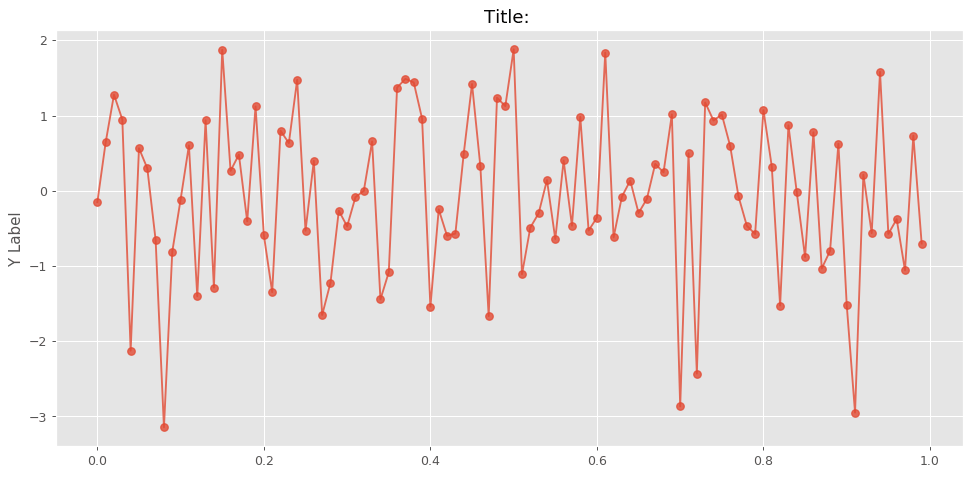
Example Using Random Data
The simplest way to test the live plotter is to input random data and watch it work! I wrote a simple script that uses numpy to generate random data and plot using the function above. This example is also in the GitHub repository and is the script used to generate the .gif image shown at the top of this blog post [click here to see it again].
from pylive import live_plotter
import numpy as np

size = 100
x_vec = np.linspace(0,1,size+1)[0:-1]
y_vec = np.random.randn(len(x_vec))
line1 = []
while True:
    rand_val = np.random.randn(1)
    y_vec[-1] = rand_val
    line1 = live_plotter(x_vec,y_vec,line1)
    y_vec = np.append(y_vec[1:],0.0)
Notice how in the above script, I do not re-plot the x-axis data. This enables us to quickly update the y-data. This is the fast-moving advantage of the line1.set_ydata(y1_data) method as opposed to the traditional plt.plot() method. The script above could also be used to update both x and y data, but more issues arise when handling both x and y movement. The x-axis limits would need to be actively moving its bounds, as well as the y-axis limits. This is not impossible, however, I think one workaround advantage is to simply change the x-axis tick labels instead and leave the actual limits alone. To actively update the x-axis tick labels use the following method:
line1.axes.set_xticklabels(date_vector)
This will maintain the limits, the x-axis tick alignments, the bounds, but change the labels on the x-axis.
Conclusion and Continuation
This short blog post introduced a simple live plotting function for Python. The live plotting function is capable of producing high-speed, high-quality, real-time data visualization in Python using matplotlib and just a few lines of code. In my next post on this subject, I will introduce live visualization of words using the same method outlined above. The word visualization will mimic a visualization method called a 'word cloud' and update words based on Wikipedia updates in real-time.
“As an Amazon Associates Program member, clicking on links may result in Maker Portal receiving a small commission that helps support future projects.”
See more in Programming: